0

Presentations Day 2 & 3

The two interfaces that interested me from Friday and today are Thematic and Trello. I really like the visual aspect of Thematic and I think that it would be really cool to take my photos from study abroad and create a visual story for each country that I visited. I think that this would be a very unique and powerful way to tell the story of my journey. I could share these stories with my friends and family who are constantly asking to view the pictures that I took during my time abroad. Due to the fact that you can only have 20 pictures per story, I think that this would be a great way to pick my 20 strongest pictures and display them so that I don’t overwhelm my audience with every single picture that I took abroad (which would be thousands). Thematic would be a great way to capture and share the best photographs that I have of my journey abroad.

Trello seems like a great tool for organization. I am a huge list maker, that is how I organize my schoolwork and my life in general. I think that this online tool would be a great way for me to add more form to my lists. I really like the color coding aspect and the way that you can make categories. This tool could be very useful for me to organize my homework for each different class, my work for my internship, and my job hunting work as well. I usually just write lists down on paper or through the note tool on Apple, but Trello could be a more professional and organized way to make my lists. The option to add images and stickers is also very useful, as well as the collaborative aspect, which could be useful in group projects for planning and organizing.

0

Checklist Observations

Checklist Observations:

1. Cover all areas of analysis in my essay: Yes, I have incorporated analysis on all of the categories in my web essay. I want to expand more on the design choices/modes of communication part.

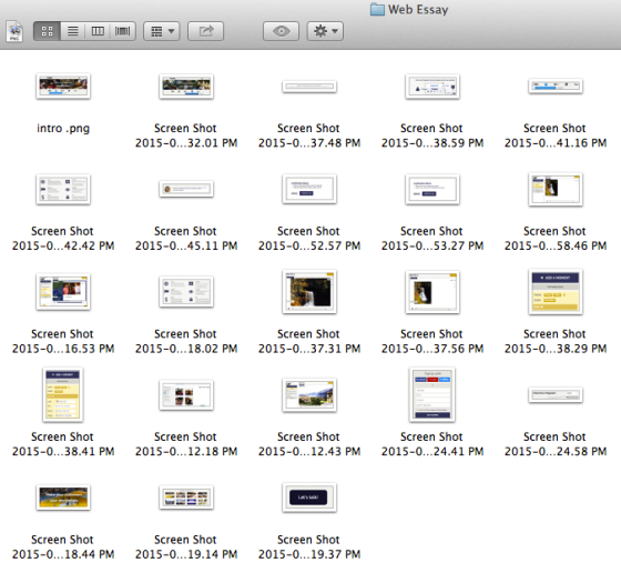
2. Include well integrated screenshots: Yes, I have incorporated screen shots into my web essay. I think that I need to work more on integrating them into the text by actually referring to them in detail.

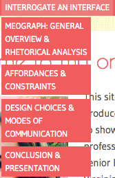
3. Set up clear navigation: Yes, I have set up both vertical navigation in my primary nav bar as well as navigation at the bottom of each page (Prev, Next buttons). I want to include a little blurb about what is coming up next in the web essay in order to guide my audience through my essay in a coherent way.

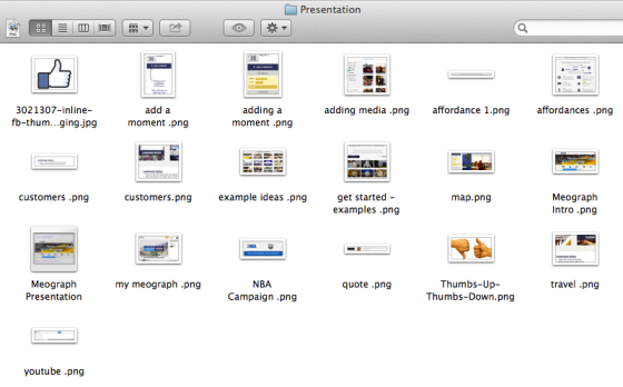
4. Embed my presentation: Yes, I have embedded my PowerPoint presentation using Slideshare. I want to add more of a conclusion/reccomendation aspect to the page.

What I Did…

I added direct references in my text to my screenshots and I added a little blurb at the bottom of each page in bold to guide my viewers towards the next categories of analysis in my essay.

Why I Did It...

Adding the direct text references gives the screenshots more meaning and helps the viewer understand why the screenshot is contributing to the overall meaning and direction of my essay. I think that referring to them directly allows them to be seamlessly integrated; there is no way a viewer will be confused about the placement/necessity of a certain screenshot.

Adding the little bolded blurbs at the bottom of each page helps my viewer seamlessly navigate through my essay. They are aware of what is coming up next and what they have just read about. I think that this extra form of navigation is very user-friendly and allows the viewer to understand the direction that the essay is going in and in what order they should navigate through the essay to view it as a whole.

0

Day 1 Presentation: Pearltrees

The tool from today’s presentations that interested me the most was Pearltrees. That was actually my first pick of the interface that I wanted to base my project on. I think that Pearltrees is a really cool concept, as it is really similar to Pinterest, and I am an avid Pinner. This is a tool that I would actually be very interested in exploring and using myself, and I think that I could create some cool boards and projects with it. It could be a useful tool in creating design boards for projects in order to gather together all of my ideas/inspirations, which is something that I currently do on Pinterest.

0

Peer Review Activity

What I Heard in Peer Review: 

Grace informed me that I had all of the required pieces, but could do a better job of specifically stating what design choices fell into what categories (emphasis, contrast, alignment, organization and proximity) instead of simply stating that the interface contained all of those design aspects. She also said that I could expand my modes of communication part as well. She liked the way that I broke up my essay and organized it into different pages.

Kim gave me the idea to add navigation at the bottom of the page as well as in the navigation bar at the top of the page. She told me that this would help my viewer navigate through the essay as a whole and coherent piece. She also told me that I should incorporate more about how to actually use the tool (how to sign up, get started, make a mix etc.) I had a lot of good rhetorical analysis, but never really covered the step by step procedure of using the tool, so I am definitely going to add that. She also recommended that I add a conclusion piece to the essay. She really liked my incorporation of screen shots, but told me that I might want to refer to them within my text.

What I Need to Do: 

  • I am definitely going to add more to my design/modes of communication page
  • I am going to work on adding extra navigation at the bottom as well as information to guide the viewer through the essay the way that I intended them to and to tie the essay together and make it more user friendly.
  • I am going to add a conclusion section.
  • I am going to add more information about how to use the tool
  • Refer to my screen shots in the text in order to incorporate them more smoothly
0

Screenshots

What I Did…

Today I started taking screenshots of Meograph for both my presentation and my web essay.

Why I Did It…

I wanted to capture as much as I could visually capture in order to really guide my audience through my web essay and presentation in a way that made sense. I think that adding visuals is very important when trying to teach someone how to use a tool. It is important to be able to visualize how something works in order to use it. The screenshots also make my web essay and presentation more interactive and visually pleasing. It was sometimes hard to capture large portions of the page, so I had to do a lot of cropping, which forced me to decide what parts of the tool were most important to share. I also had a problem with using Jing for screenshots, sometimes when I transferred my Jing screenshots to WordPress they became really blurry, so I had to retake a bunch of screenshots using the incorporated Mac screenshot feature, so that was really annoying.

Screen shots for my web essay & presentation: 

Screen Shot 2015-03-26 at 1.07.08 PM

Screen Shot 2015-03-26 at 1.07.28 PM

0

Drafting Web Essay

What I Did…

Today I began drafting my web essay using the Writer/Designer analysis questions as a guide. I decided that I was going to break up the essay into four different sections: General Overview & Rhetorical Analysis, Design Choices & Modes of Communication, Affordances & Constraints, and Presentation & Conclusion. I took all of my information that I had compiled through my exploration of Meograph and began to put it into a coherent essay form.

Why I Did It…

I think that breaking the web essay up into different pages is a good way to make it more organized and less overwhelming. I didn’t want to make a separate page for each category because I think that would make the project way to broad and all over the place, so I attempted to combine categories in a way that flows and makes sense and makes the web essay more concise. It was difficult at first to take my basic bullet point notes and turn them into an essay, but once I got into the swing of it it started to come naturally. The one thing that I was afraid of was repeating information in different sections, so I know that I will have to do some extensive editing to ensure that I don’t repeat myself or make the essay too wordy.

My Writer/Designer analysis questions

Navigational Structure: 

Screen Shot 2015-03-26 at 12.52.03 PM

0

Independent Work – Friday March 6

IMG_4424

What I Did…

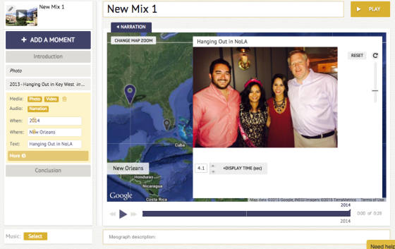
I spent my 50 minutes of independent work getting familiar with Meograph. I read through all of the information that the website contained and started trying to develop my own mix in order to really understand how the tool worked. I decided to make a mix about my travels with my family, using pictures from the Cascades and New Orleans. I filled in the Writer/Designer analysis questions as I was exploring the interface.

Why I Did It…

Filling out the Writer/Designer analysis questions form is going to be an extremely useful tool for organizing my web essay and ensuring that I cover all of the different aspects of analysis, including the rhetorical situation, design choices, modes of communication, and affordances and constraints. Also, playing around with creating my own mixes is important because I am actually enabling myself to analyze the tool from an actual user’s perspective.

My Writer/Designer Analysis Questions

Working on my first Mix: 

Screen Shot 2015-03-23 at 9.16.53 PM

0

Project 3 Examples Exercise

I was really surprised to see that my group’s example project was a website in itself, instead of just a web essay. It never occurred to me that a website would be a good way to present this project. Making the project into a cohesive website with tabs is a very organized and professional way to do the project. Personally, I think that her website was a little too much (too many tabs/links etc.), however I am now considering making my project into more of a website now instead of just a one page web essay.

Two things that she really did well was incorporating screenshots and personal anecdotes about her experience using the application. I definitely want to also incorporate screenshots and personal anecdotes because they made it very easy for me as a viewer to understand how to use the application and to visualize her experience using the application. She did a great job of commenting on what was confusing, bad, good, and easy about the application without bashing the application or praising it. It was a very unbiased and informative account, which will help viewers decide how they personally feel about the application.

0

Project 3 Tool: Meograph

I choose to analyze Meograph, a site that allows customers to create a video focused on their brand that they can then embed into their own websites. I was attracted to this tool because it is a brand marketing tool, and I want to pursue a career in digital brand marketing. Therefore, this tool could be something that I could utilize in my future job. I also can use this tool to create a video focused on my brand that I can then display on my personal website. Analyzing this tool will allow me to add another skill to my arsenal that I can implement in my future career and that I can show a future employer in order to make me a more qualified and tech savvy candidate.